The coordination mechanics
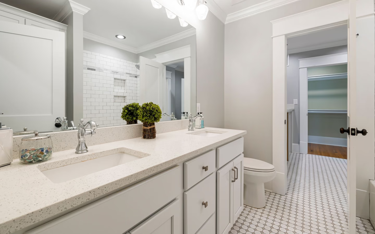
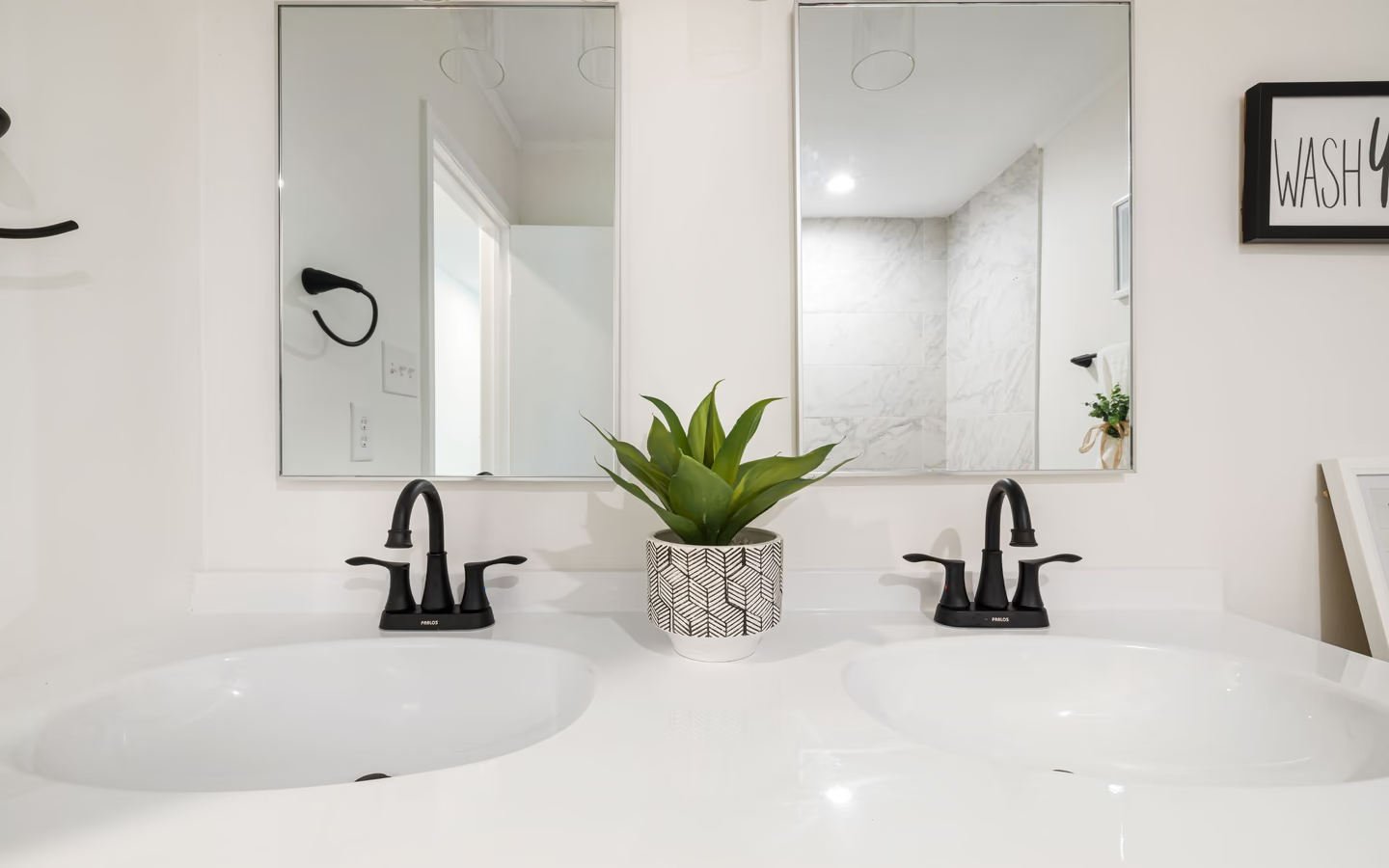
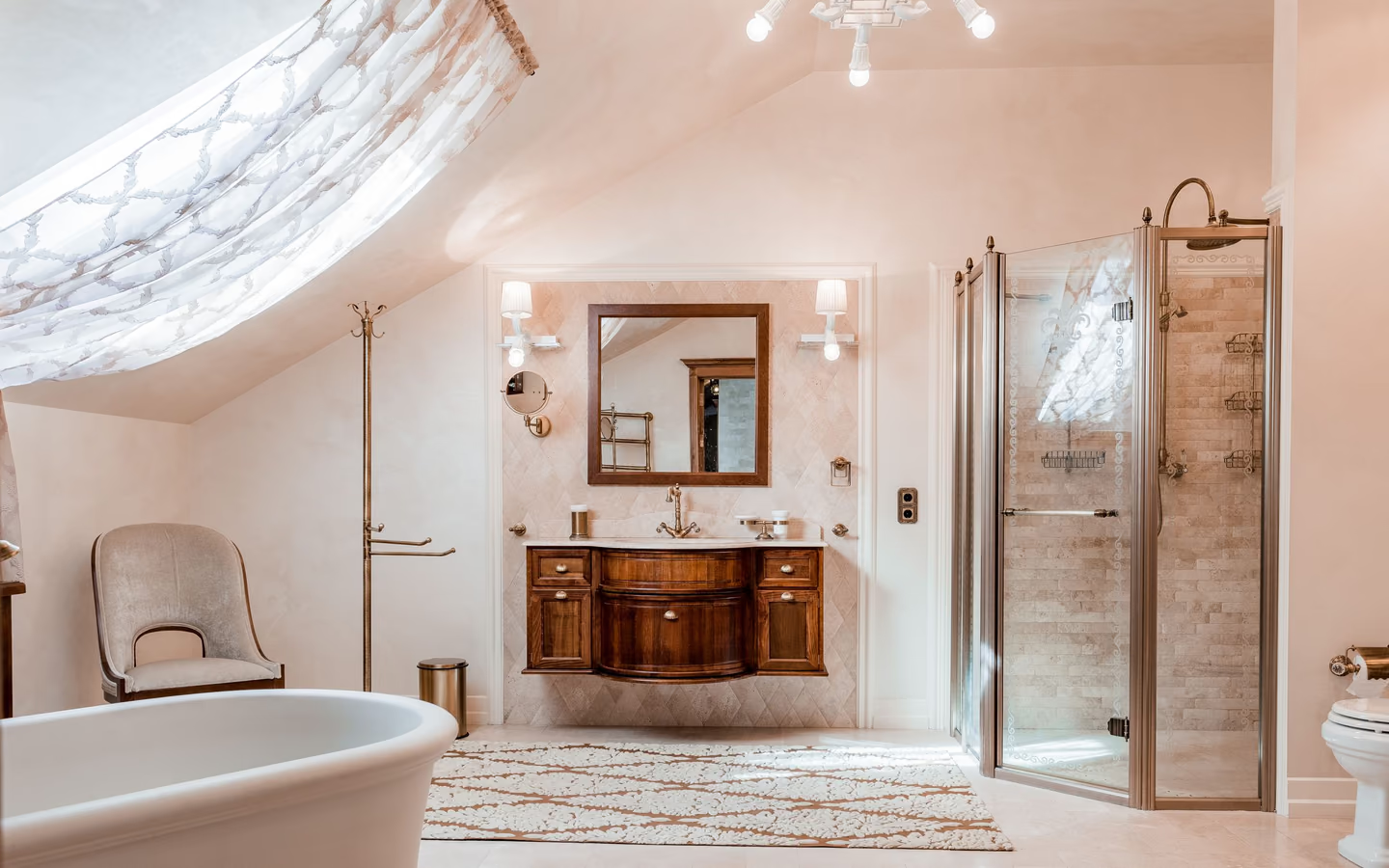
Undertone discipline does the heavy lifting: most palette dissonance is undertone conflict, a violet-gray floor against a green-gray wall, pink-beige stone against yellow-beige cabinets. Sorting every candidate into warm, cool, or neutral before styling begins prevents the conflicts that no accessory can fix later; the sample board is where the sorting gets tested honestly.
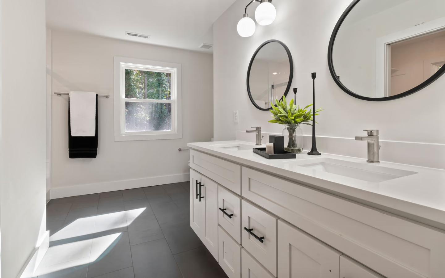
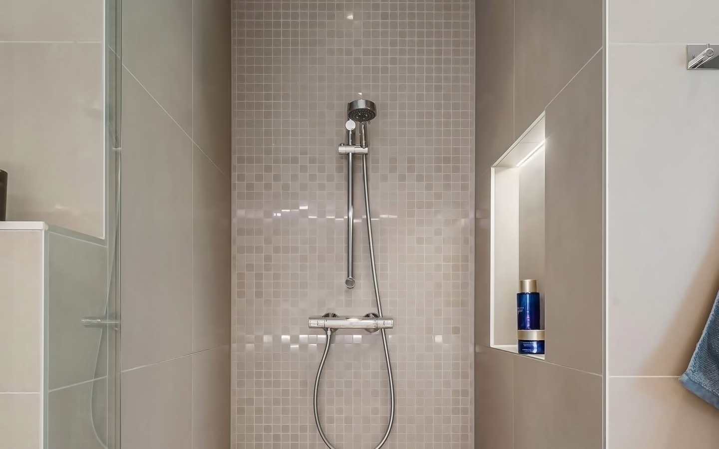
Sheen and texture are palette members too: glossy tile reflects and sharpens its color, matte surfaces absorb and soften the same pigment, and the identical paint chip reads differently over eggshell and semi-gloss. Wet rooms also constrain by function, higher sheens where wiping is constant, matte where glare would bounce, so the sheen map follows both light and cleaning.
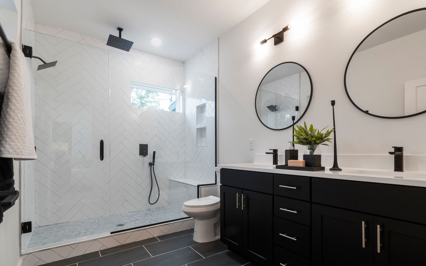
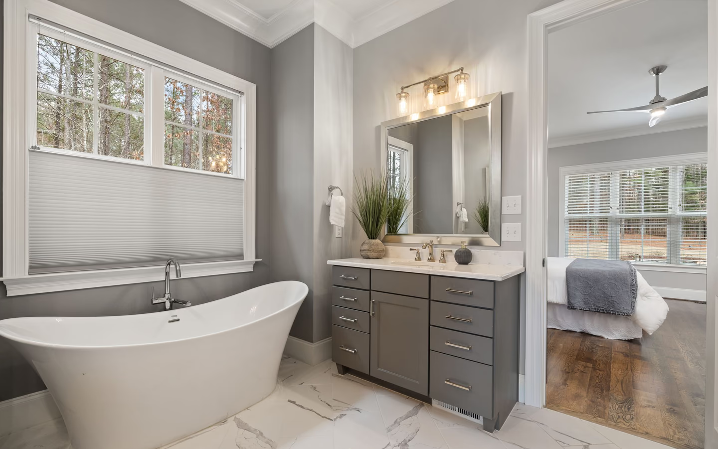
Grout, metals, and wood complete the chord: grout either blends its tile field into calm or draws the grid as pattern, a palette decision wearing a maintenance costume; metal finishes act as jewelry whose warmth must agree with the palette's temperature; and wood tones, vanity, trim, accessories, want one family rather than three near-misses. The final sign-off is one photograph of the approved board in the room's light, filed with the selections, so every later substitution has a truth to match.